Why Your Website Isn’t Converting (and What to Do About It)
More Visitors Won’t Help If Your Website Can’t Close
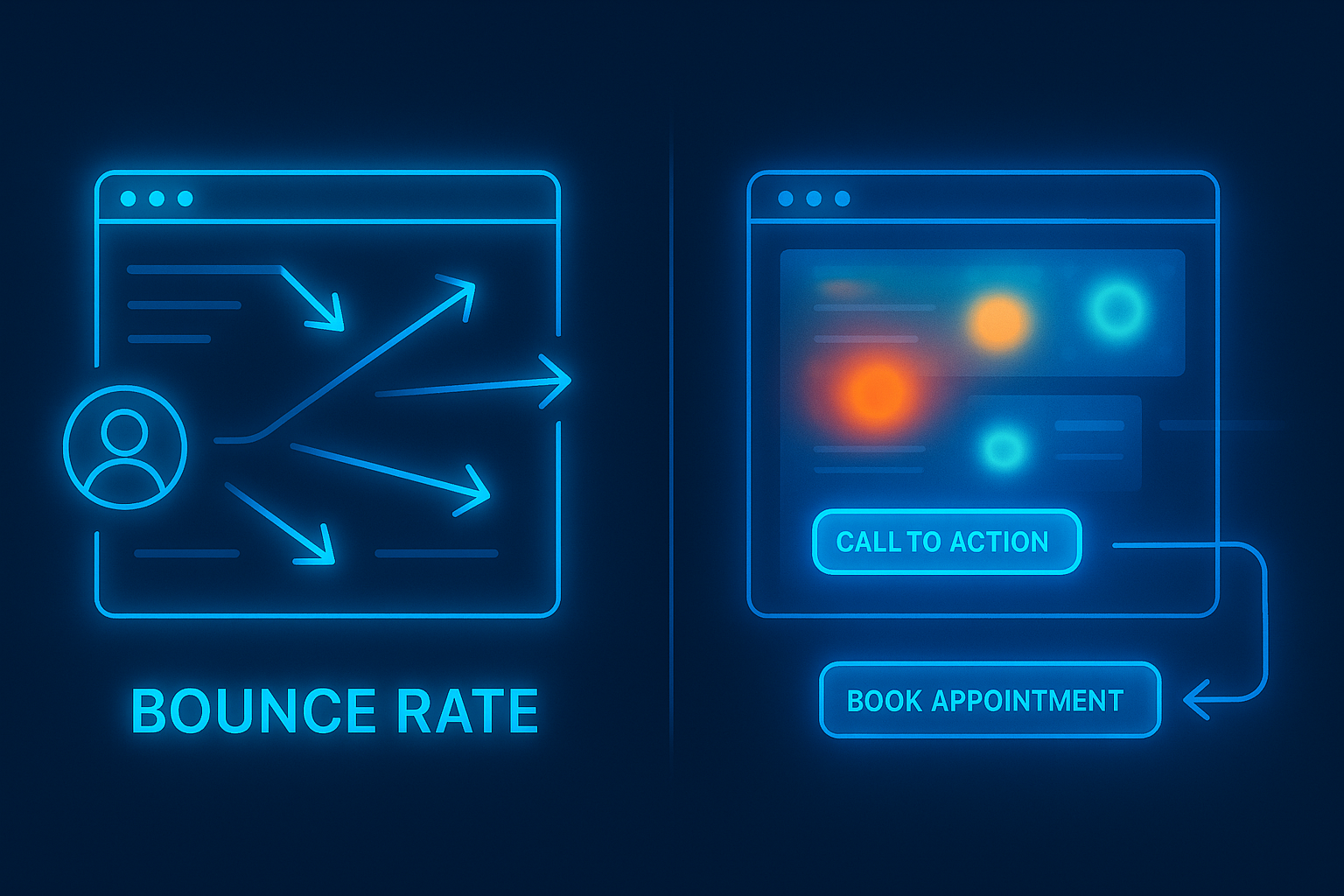
You can have the prettiest website in the world and still lose business every day if it doesn’t convert. You know the story—someone clicks your ad, lands on your site, scrolls for a few seconds... and then disappears. No form fill. No call. No booking. Nothing. That bounce isn’t just lost engagement—it’s lost revenue. And chances are, it’s not your marketing that’s broken—it’s your site.
If your site can’t convert, driving more traffic just wastes money faster.
Let’s break down why it’s happening—and how to fix it so your website becomes your hardest-working salesperson.
The Most Common Website Conversion Killers
1. No Clear Call-to-Action (CTA)
Visitors need to know exactly what to do next. If your site just says “Welcome to our business!” with no direction, you’re making them guess—and most won’t.
Fix it: Add a bold, above-the-fold CTA that says exactly what they’ll get. Examples:
- “Get a Free Quote”
- “Book Your Free Call Now”
- “Download the Checklist”
2. Too Many Choices
Confusion kills conversion. If you give people 10 different buttons, links, and menus, they’ll choose none.
Fix it: One primary action per page. Everything else should support that goal.
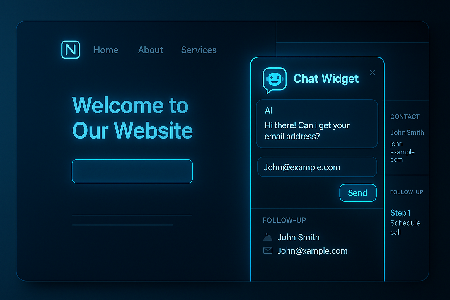
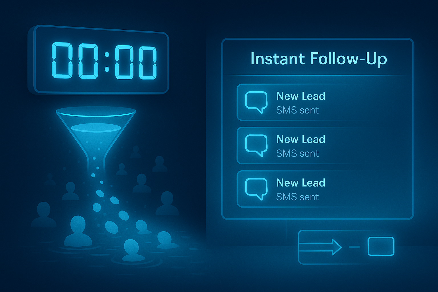
3. No Follow-Up Tool
Someone might land on your site, be interested, but not ready to commit. Without a chat widget or email capture, you’ve lost them.
Fix it: Install a chat widget or pop-up that offers:
- A free resource
- A discount
- A way to text you a quick question
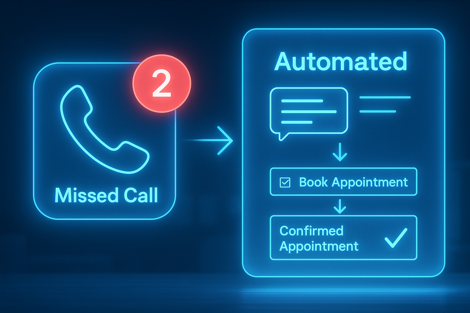
Check out How to Turn Missed Calls into Booked Appointments Automatically to learn about the power of automated chat widgets and SMS replies.
Why Speed and Mobile Optimization Matter
Google found that 53% of mobile users abandon sites that take longer than 3 seconds to load.
If your site is slow or clunky on mobile, it’s not just annoying—it’s costing you leads.
Fix it:
- Compress your images.
- Use mobile-friendly design.
- Cut unnecessary code or animations.
Pro tip: Test your site on your own phone. If you have to pinch, zoom, or wait—it’s time for a redesign.
Real Example: How Basecamp Boosted Conversions with Simplicity
Basecamp, a project management platform, once had a feature-heavy homepage trying to explain everything they did. It underperformed. They stripped it down to a single headline, a simple explainer, and one big CTA. Conversions went up. Clarity wins.
5 Fixes You Can Make This Week to Increase Conversions
- Add a clear, benefit-driven CTA to your homepage.
- Simplify your navigation—keep 3-5 menu options max.
- Use a heatmap tool (like Hotjar) to see where people are dropping off.
- Install a chat widget or form with autoresponders.
- Make sure your mobile experience is seamless.
The Website Formula That Works
Here’s a simple layout that converts:
- Headline: Speak to the visitor’s problem.
- Subheadline: Highlight your solution.
- CTA: Tell them what to do next.
- Social proof: Reviews, logos, case studies.
- Bonus CTA: Another chance to take action at the bottom.
That’s it. No fluff. Just focus.
Check out Why Marketing Isn’t Enough to learn why traffic doesn’t convert without structure.
Final Takeaway
Your website isn’t just a digital brochure—it’s a conversion machine. Or at least, it should be.
If your site isn’t booking leads, capturing interest, or driving action, it’s not finished.
You don’t need a full redesign. You need strategic fixes that speak to the right people—and move them to act.
Next Steps
Not sure why your site isn’t converting? Schedule a conversion audit with The Omnia Co. We’ll walk through your current funnel, find the gaps, and show you exactly what to fix to turn visitors into booked appointments, sales, or subscribers.
More Marketing Tips, Tricks & Tools